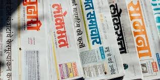
The visual landscape of Hindi newspapers is a dynamic tapestry, woven with the threads of tradition and modernity. At the heart of this visual experience lies the crucial element of font selection. More than mere characters, Hindi fonts in Indian newspapers play a pivotal role in shaping readability, conveying tone, and preserving the cultural essence of the language. This article explores the nuanced world of Hindi fonts used in Indian newspapers, examining their historical evolution, contemporary trends, and the challenges they face in a rapidly changing media environment.
A Historical Glimpse: From Lithography to Digital Typesetting
The journey of Hindi fonts in newspapers began with the advent of printing technology. Early Hindi newspapers relied heavily on lithography, where calligraphers painstakingly created text on stone plates. This method, while artistically rich, was time-consuming and lacked consistency. The introduction of metal types in the late 19th and early 20th centuries marked a significant turning point. These metal types, often based on calligraphic styles like Devnagari, enabled mass production and wider dissemination of Hindi newspapers. However, the limitations of metal type constrained design flexibility.
The advent of digital typesetting in the late 20th century revolutionized the printing industry, including Hindi newspapers. This technological shift ushered in an era of unprecedented font diversity and design possibilities. Software like PageMaker and QuarkXPress empowered designers to create and manipulate fonts with greater ease, leading to a proliferation of new Hindi typefaces.
Key Characteristics of Hindi Newspaper Fonts:
Hindi newspaper fonts are designed with specific considerations in mind, prioritizing readability, efficiency, and cultural relevance. Here are some key characteristics:
- Legibility: Given the complex nature of the Devnagari script, with its numerous conjunct characters and matras (vowel signs), legibility is paramount. Fonts must be clear and easy to read, even at small sizes.
- Space Efficiency: Newspapers are constrained by space, so fonts must be designed to maximize the amount of text that can fit on a page without compromising readability.
- Cultural Authenticity: Hindi fonts often reflect the calligraphic traditions of Devnagari, preserving the aesthetic heritage of the script. However, they also need to adapt to contemporary design sensibilities.
- Versatility: Newspaper fonts must be versatile enough to accommodate different sections and formats, from headlines to body text.
- Clarity of Conjuncts: The complexity of the Devnagari script lies in its conjunct characters. Newspaper fonts must render these complex characters in a way that is clear and unambiguous.
Popular Hindi Fonts in Newspapers:
Several Hindi fonts have gained popularity in Indian newspapers, each with its unique characteristics:
- Kruti Dev: A widely used font, especially in older publications and government documents. It is a legacy font that was very popular in the early days of digital publishing. While still used, its design limitations and lack of Unicode compliance have led to its gradual decline.
- Mangal: A Unicode-compliant font that has become a standard in many Hindi newspapers. It offers good readability and supports a wide range of Devnagari characters.
- Aparajita: Another Unicode font known for its clean and modern design. 1 It is often used for body text and headlines.
1. Aparajita font family – Typography – Learn Microsoft
- Arial Unicode MS: While a general-purpose Unicode font, it is sometimes used in Hindi newspapers due to its broad character support.
- Custom Fonts: Many major Hindi newspapers have developed custom fonts tailored to their specific needs and brand identity. These fonts often incorporate unique design elements and optimize readability for their target audience.
Challenges and Trends:
The world of Hindi fonts in newspapers is constantly evolving, facing both challenges and opportunities.
- Unicode Adoption: The transition to Unicode has been a significant challenge, as many legacy fonts are not Unicode-compliant. However, Unicode adoption is crucial for ensuring cross-platform compatibility and accessibility.
- Screen Readability: With the rise of digital media, Hindi newspapers must adapt their fonts for optimal screen readability. This requires careful consideration of font rendering on different devices and screen sizes.
- Font Design and Innovation: There is a growing need for innovative Hindi font designs that cater to contemporary aesthetics and user preferences. This includes exploring new calligraphic styles and incorporating modern design elements.
- Accessibility: Ensuring that Hindi fonts are accessible to visually impaired readers is crucial. This involves developing fonts that are compatible with screen readers and other assistive technologies.
- Regional Variations: Hindi is spoken in various regions of India, and there are subtle variations in the script and pronunciation. Newspapers often need to consider these regional variations when selecting fonts.
- Web Typography: With the growth of online news platforms, the importance of web typography for Hindi has increased. The ability to render Hindi text correctly on various browsers and devices is a crucial concern.
The Future of Hindi Fonts in Newspapers:
The future of Hindi fonts in newspapers lies in embracing innovation and adapting to the changing media landscape. This includes:
- Investing in the development of high-quality Unicode-compliant fonts.
- Prioritizing screen readability and accessibility.
- Encouraging font design innovation and experimentation.
- Promoting the use of open-source fonts.
- Standardizing web typography for Hindi.
By addressing these challenges and embracing these opportunities, Hindi newspapers can ensure that their visual language remains vibrant, relevant, and accessible to a diverse audience. The font that they choose is a very important part of the newspapers identity, and the ease of reading.
For more updates stay tuned Hindi fonts.